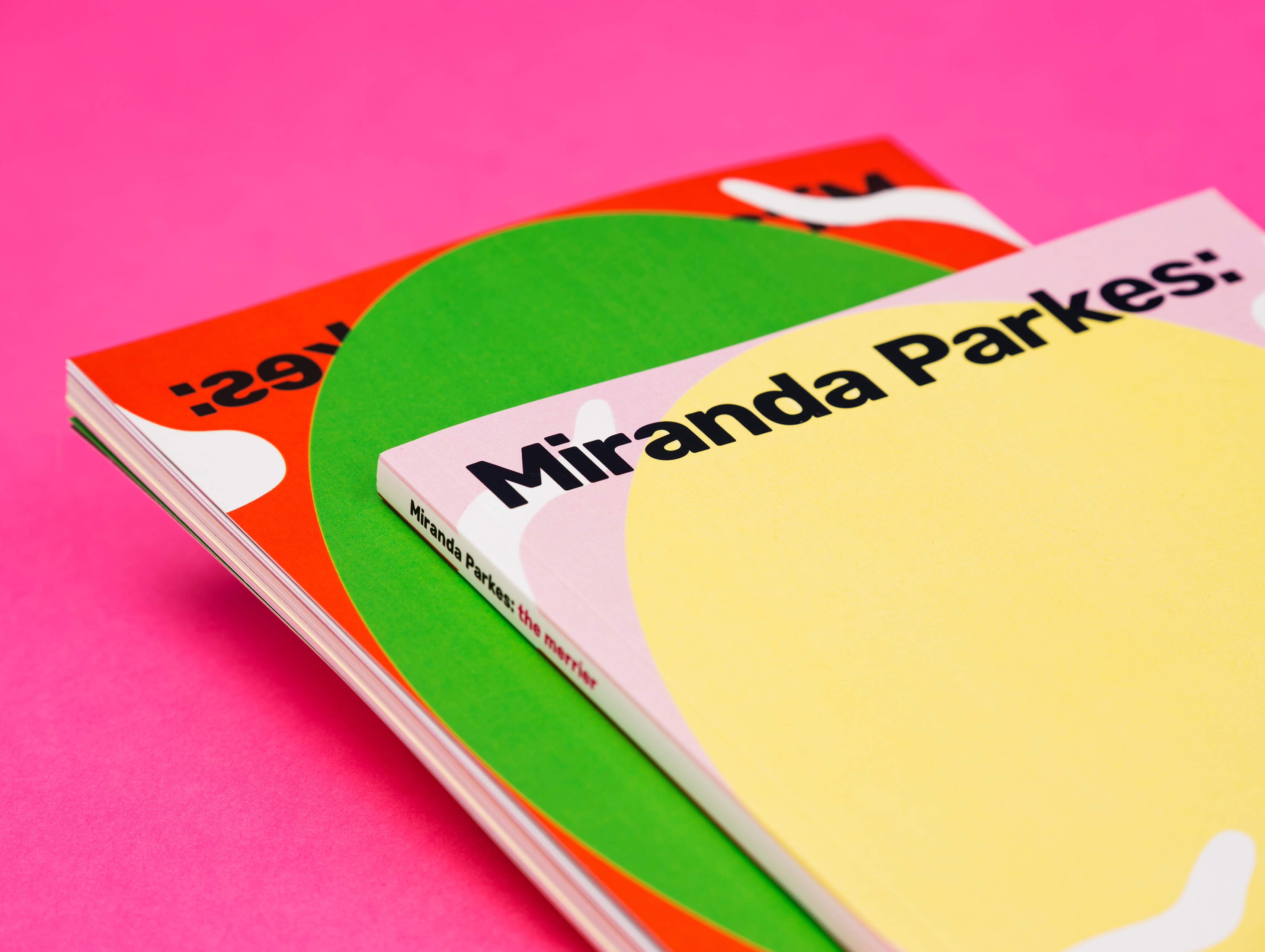
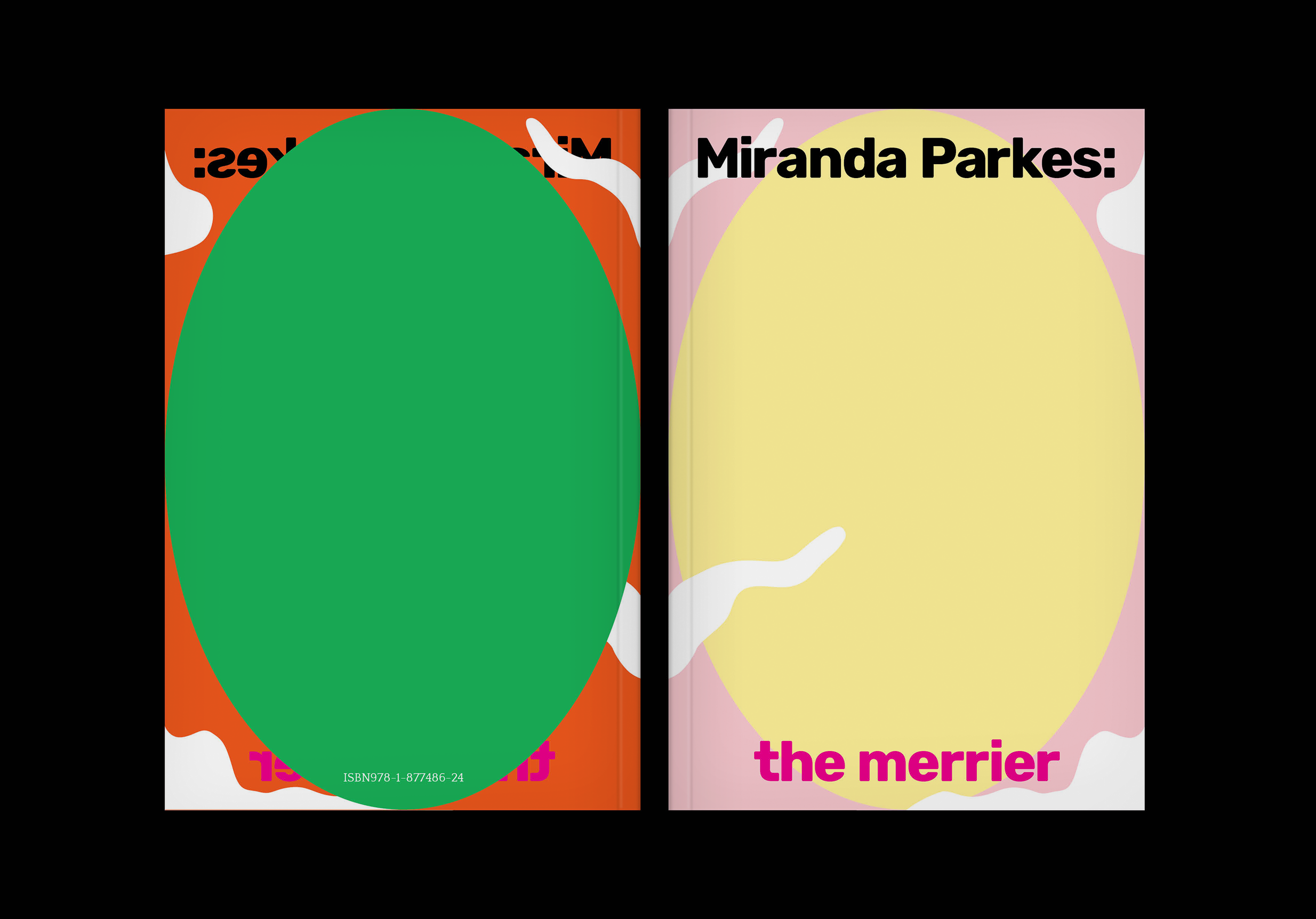

MIRANDA PARKES: THE MERRIER
PUBLISHER:
Hocken Collections, Uare Taoka o Hākena,
University of Otago
FORMAT:
240 x 164mm, 100pp plus folded insert.
Perfect bound with spot gloss.
Cover printed on Silk Matt 300gsm
and text printed on Silk Matt 150gsm.
Royal High Bright 140gsm
Trophee coloured paper also used.
TYPE:
Rubik by Hubert & Fischer
and Quattrocento by Impallari Type
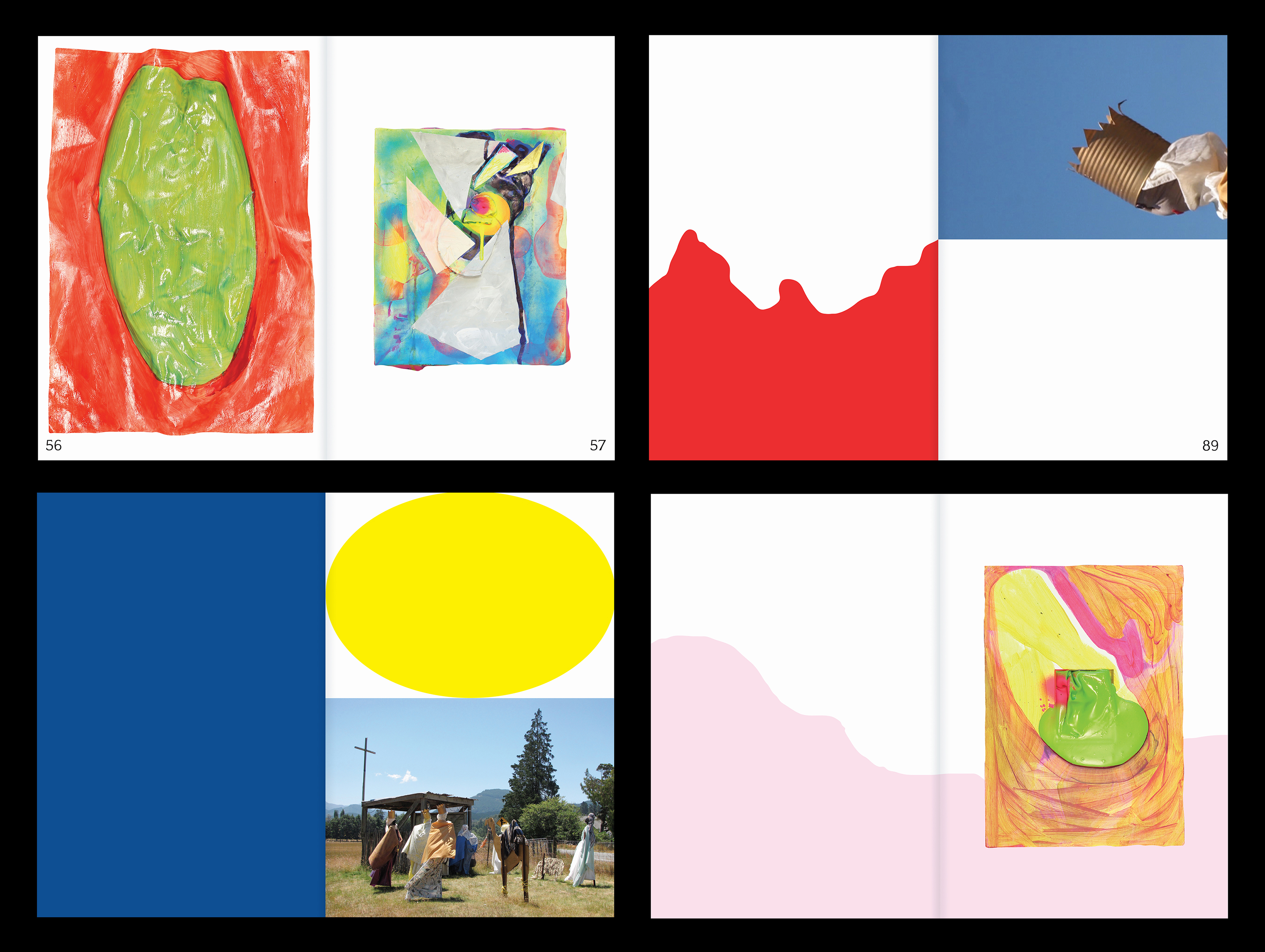
The merrier publication was designed to reflect artist Miranda Parkes’ playful use of colour and form. Drawing on the expanded field of painting, Parkes makes art that speaks to the bodily experience and subjectivity of abstraction.
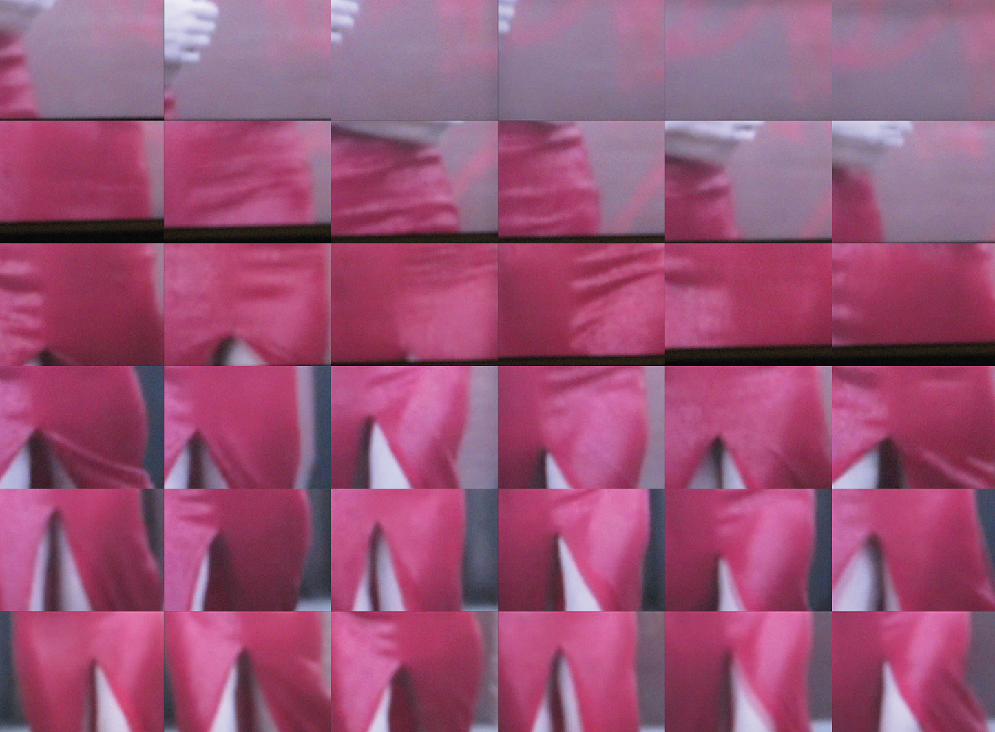
Known for her puffed, twisting, bulging, works, she treats painting as a spatial medium and creates works that are physical, sculptural and material. ‘More is more’ in this publication assembled with full saturated and softly bled gradients of colour.
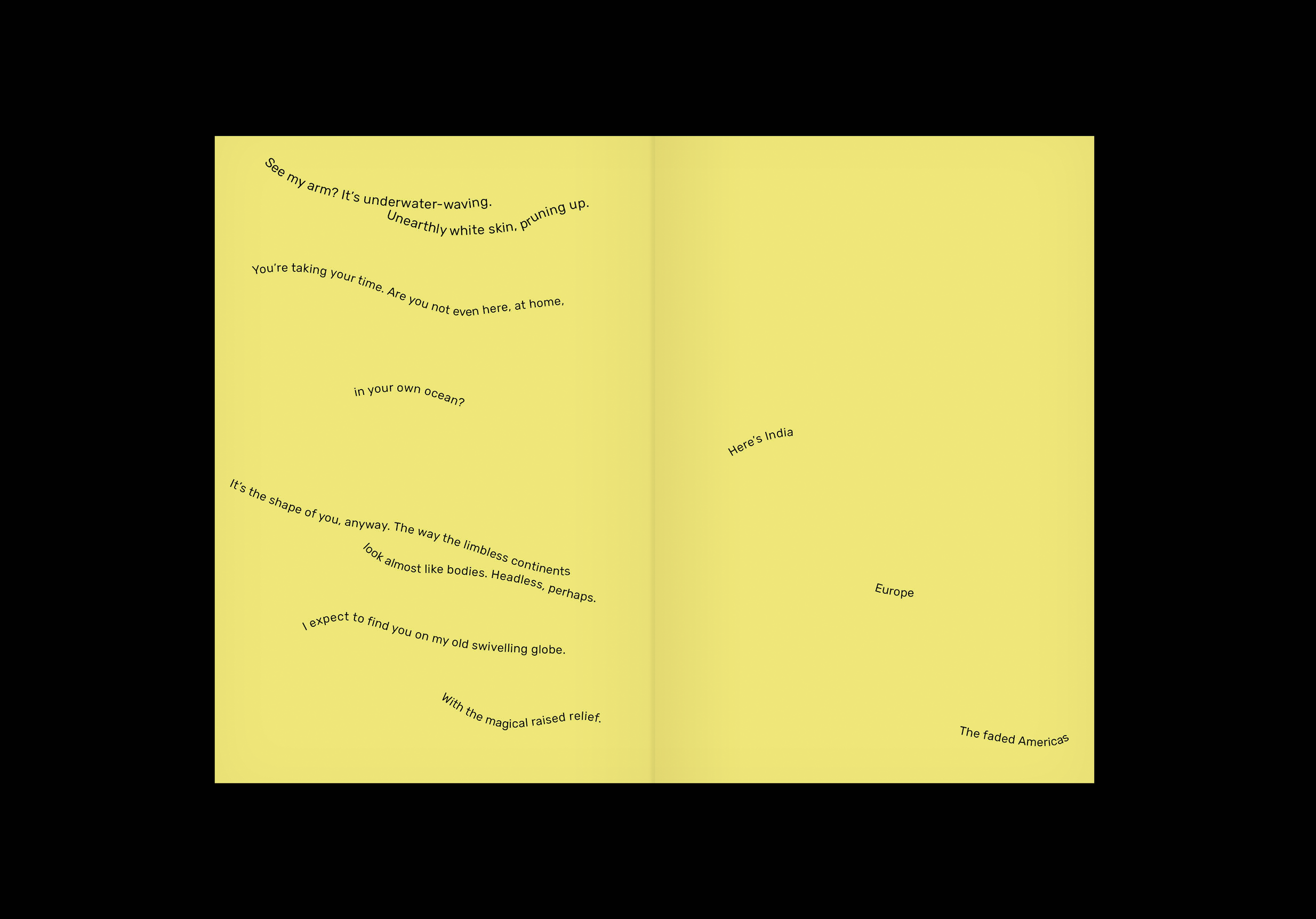
the merrier publication speaks to the language of painting, with textual references filtering through the artist’s new body of work illustrated throughout. The publication design mirrors the artist’s interest in the overlap between art, poetry and everyday life.
In testing the qualities of her materials, Parkes simultaneously reveres and rejects the ideals of modernism, and this approach carries through in the design of the book. If painting is a text, the question becomes not what is written, but how it is read, and by whom?
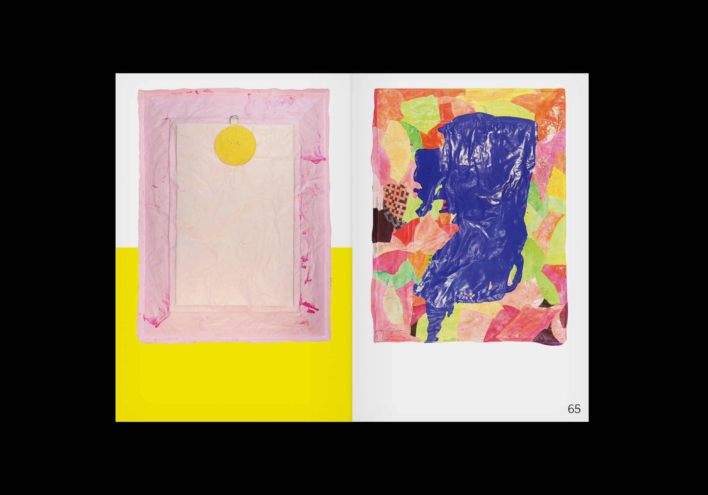
Designed to accompany an exhibition with the same name, the merrier experiments with colour, shape, and texture. A variety of paper stocks used relates to the tactile nature of Parkes’ paintings, and the illustrated spread depicts the front and backs of Parkes’ paintings – offering a democratic approach to an otherwise formal medium, whilst at the same time giving a nod to book design terminology recto and verso.
Curator of Art - Pictorial Collection
Hocken Collections